 How-to
Avoiding Poor Print Quality: A Practical Checklist for UK Printing
Last Updated: November 4, 2026
Quick Summary
Poor print quality usually comes from artwork set up for screens rather than paper. Use the exact finished size with 3mm bleed, keep images at 300 ppi at final print size, convert to CMYK early, and request a physical proof before a large run.
- Add a bleed of 3mm on every edge that touches the trim.
- Keep text at least 3mm inside the trim line.
- Aim for 300 ppi at the actual print size, especially for text and small logos.
- Divide pixel width by print width in inches to find true resolution.
- Ask for a physical proof before ordering a large run.
Table of Contents
- Preparing Your Files for Sharp, Accurate Print
- Checking Image Resolution Before You Order
- Colour Settings, CMYK and Whether Soy Ink Affects Accuracy
- Your Next Step: Send a Test File for a Free Artwork Check
- Frequently Asked Questions
Preparing Your Files for Sharp, Accurate Print
Poor print quality usually starts long before the file reaches the press. Most problems trace back to artwork set up for a screen rather than paper, so getting the file right first saves time, cost and frustration.
Set your document to the correct size, including bleed, and keep text and key elements clear of the trim line. Save the final file as a print-ready PDF.
Watch out: sending an RGB file without converting it can shift colours noticeably on paper, so check your settings before you export.
- Set the document size to the exact finished dimensions, and if you are preparing artwork for a bound project, browse our hardback books range for a product that suits the same clean file setup.
- Add a bleed of 3mm on every edge that touches the trim
- Keep text at least 3mm inside the trim line
- Export as a press-ready PDF with fonts embedded
Checking Image Resolution Before You Order
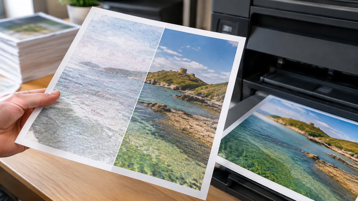
Images are the most common cause of soft, blurry results. Stretch a small web image to fill an A4 sheet and it will look rough in print. The working rule is 300 pixels per inch (ppi) at the size the image will actually print.
Resolution is not a property of the file alone: the same image can be sharp at A6 and soft at A3 because the pixels are spread over a larger area. What matters is pixel density at final print size, found by dividing the image's pixel width by the intended print width in inches. A 2480-pixel-wide image printed at the width of an A4 sheet (210mm) gives 300 ppi; the same image printed at the width of an A3 sheet (297mm) gives 150 ppi, usually too soft for text and fine detail.
Here is the pixel maths for common sheet sizes at 300 ppi:
| Print size | Width × height (mm) | Minimum pixels at 300 ppi |
|---|---|---|
| A6 postcard | 105 × 148 | 1240 × 1748 |
| A5 flyer | 148 × 210 | 1748 × 2480 |
| A4 flyer | 210 × 297 | 2480 × 3508 |
| A3 poster | 297 × 420 | 3508 × 4961 |
| A2 poster | 420 × 594 | 4961 × 7016 |
For large-format work viewed from a distance, 150 ppi is often acceptable, and 200 ppi is a sensible compromise for posters. For body text and small logos, stay at 300 ppi. Do not confuse ppi with dpi: ppi describes the image's pixel density, while dpi describes the printer's dot output.
Check each image's pixel dimensions against the print size in your design software. If an image falls short, replace it with a higher-resolution original rather than scaling it up, since upscaling adds interpolated pixels but no real detail.
Watch out: a file can carry a high ppi tag while containing few real pixels, so always check the pixel dimensions rather than trusting the metadata.
Colour Settings, CMYK and Whether Soy Ink Affects Accuracy
Screens show colour as RGB light, while presses print with CMYK inks. Bright blues and neon greens often look different once printed because those colours sit outside the CMYK gamut. Convert your artwork to CMYK early so you can see the likely result before ordering.
Conversion alone is not enough: the colour profile controls how RGB numbers map to CMYK ink values, and different profiles produce different results from the same file. For a deeper look at how ink and colour are handled in production, read our litho printing services across the UK article. Ask your printer which profile they recommend, use it consistently, and keep it embedded in the PDF.
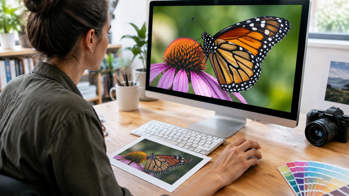
Proofing is the only reliable check. A soft proof on a calibrated monitor catches obvious problems, but a physical proof shows what the press will actually produce. Request one before a large run and compare it under consistent lighting.
Soy-based inks are widely used in print, though results still depend on the press, paper and colour profile used. If you are comparing inks, ask the printer for a proof on the actual stock rather than relying on general claims.
A simple diagnostic test pattern helps you isolate colour problems. Include a small patch of known CMYK values and a grey ramp in your test file, then check whether the greys stay neutral and the patches match the expected values. If greys drift towards a colour cast, the profile or the press calibration is the likely cause. FOGRA characterisation data and profiles
- Work in CMYK from the start if the job is going to print
- Use the same colour profile your printer recommends and embed it
- Ask for a physical proof before a large run
- Include a grey ramp and CMYK patches in test files to catch casts
Watch out: converting a file from RGB to CMYK and back again does not restore the original colours, so keep an untouched RGB master if you may need to reprint.
Your Next Step: Send a Test File for a Free Artwork Check
The fastest way to avoid poor print quality is to have a second pair of eyes review your file before it goes to press. Print Brain offers a free artwork check, so you can catch resolution, bleed and colour issues early.
Send us a test file and we will review it against the points above. Our team is also happy to provide bespoke quotes.
Frequently Asked Questions
Why is my printer producing blurry or faded text?
Blurry or faded text is usually caused by low-resolution source files, a worn or misaligned print head, or the wrong paper setting for the stock being used. Check that text and images are placed at full size in your design software rather than enlarged after placement. If the problem is faded output across the whole page, the print head may need cleaning or alignment. Print Brain offers a free artwork check if you are unsure which factor is responsible.
How does file resolution affect final print quality?
Print resolution is measured in dots per inch (dpi), and images for professional print are generally prepared at 300 dpi at final printed size. A file at 72 dpi may look sharp on screen but will appear pixelated or soft when printed at the same dimensions. Check resolution in your editing software before you export, and avoid scaling small images up to a larger size, because enlarging does not add detail. Using vector files for logos and text keeps edges sharp at any size.
Does paper quality affect the final print output?
Yes. Paper weight, coating and absorbency all influence how ink sits on the surface, so the same file can look sharper on one stock than another. Ask your printer for a sample if you are unsure which finish suits your design.