 How-to
How to Create a Matching Business Stationery Set
Last Updated: November 9, 2026
Quick Summary
A business stationery set is a group of matching printed items, such as business cards, letterheads, envelopes, compliment slips and notepads, that share the same colours, fonts and logo placement. To create one, set your brand foundations first, design the letterhead as the anchor, then build the other items from its layout and prepare print-ready artwork before ordering.
- Write down brand colours, two fonts and logo versions before designing anything.
- Design the letterhead first, since envelopes, compliment slips and notepads should borrow its layout.
- Use 3mm bleed on all sides and keep text and logos at least 3mm inside the trim line.
- Use CMYK colour and at least 300dpi images at final print size for print-ready artwork.
- Approve a proof of one business card and one letterhead before ordering the full quantity.
Table of Contents
- What a Business Stationery Set Includes and Why Consistency Matters
- Business Stationery Checklist: Choosing the Core Items
- Setting Your Brand Foundations: Colours, Fonts and Logo Use
- Designing a Business Letterhead That Anchors the Set
- Preparing Print-Ready Stationery Artwork
- Paper, Budget and Quantities: Making the Set Work on Your Spend
- Ordering Your Set and Reordering Without Losing Consistency
- Frequently Asked Questions
What a Business Stationery Set Includes and Why Consistency Matters
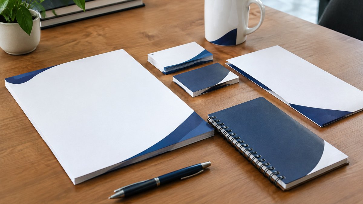
A business stationery set is the group of printed items your company uses to communicate: business cards, letterheads, envelopes, compliment slips and notepads. When every piece shares the same colours, fonts and logo placement, each one reinforces the others. A matched set helps a client see that a letter and a card came from the same company.
Consistency matters because people judge quality quickly. A mismatched card and letterhead can suggest a business that has not thought things through. A matched set signals care, and it saves time, because your team stops guessing which logo file or shade of blue to use.
Here is what a complete set usually covers:
- Business cards for contact details at meetings and events
- Letterhead for formal letters, quotes and invoices
- Envelopes that carry the same design as the letterhead
- Compliment slips for a short personal note with a parcel or document
- Notepads for internal use and client meetings
Many small teams start with cards and add the rest over time. That works, provided you set up your design rules first, so each new item fits the existing set.
Business Stationery Checklist: Choosing the Core Items
Before you order anything, decide which items you actually need. A sensible starting point for most businesses is a short core list:
- Business cards (standard or square, see our Plastic Business Cards range for durable options)
- Letterhead, the anchor of the set, covered in the next section
- Compliment slips for parcels and follow-up notes
- Envelopes in sizes that match your letterhead
- Notepads, if your team takes notes with clients
Square cards are a good choice if you want the set to stand out. Our square business cards suit brands with a modern look, while standard sizes fit more easily into existing card holders. Choose one format and keep it across the set.
Start small. Ordering the three items you use most every week is often better than ordering a full range you rarely touch.
Setting Your Brand Foundations: Colours, Fonts and Logo Use
Your brand foundations are the rules that every item follows. Write them down before you design anything. A short sheet with the following details is enough:
- Primary and secondary colours, with exact values such as HEX or CMYK codes
- Two fonts at most, one for headings and one for body text
- Logo versions, including full colour, one-colour and reversed versions for dark backgrounds
- Minimum logo size and clear space around it
- Contact detail format, such as phone number style and address layout
Common mistakes include using a screen-only colour on print, which often looks duller on paper, and mixing too many fonts. A common approach is to pick one strong heading font and one simple body font, then use them everywhere.
Watch out: a logo saved from a website is usually too low in resolution for print. Ask your designer for a vector file (such as EPS or PDF) before you start.
Designing a Business Letterhead That Anchors the Set
The letterhead is the item the rest of the set is built around. Envelopes, compliment slips and notepads should all borrow its layout, so design it first.
A solid letterhead includes your logo, company name, address, phone number, email and website. Keep the top area compact so there is room for writing. Many businesses place the logo at the top left and contact details in a small line across the bottom, leaving the middle clear for letters.
Consider how the design will look when a letter is printed in black and white on a desk printer. Your colours should still work when the logo is printed in one colour. Test a proof on your own office printer before placing a full order.
Our letterhead range lets you compare sizes, paper weights and finishes, so you can see how the design feels in hand before you commit.
Preparing Print-Ready Stationery Artwork
Print-ready artwork is the file a printer can use without changes. Getting this right prevents delays and reprints. Most production problems trace back to a small number of file errors, so work through the checks below in order rather than dipping in and out.
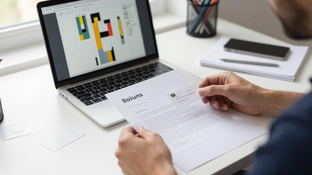
Step 1: Set up the document correctly before you design. Build every item at its true trim size, then add 3mm bleed on all four sides. For a standard business card of 85mm × 55mm, the artboard becomes 91mm × 61mm. Keep all text and logos at least 3mm inside the trim line, the safe zone, so nothing is clipped when the guillotine cuts the stack. If you design at the wrong size and scale up later, stroke weights and logo clear space drift out of proportion.
Step 2: Work in the right colour mode and resolution. Use CMYK for anything going to a litho or digital press, not RGB. Convert images to at least 300dpi at final print size; a logo pulled from a website is typically 72dpi and will look soft or pixelated on paper. Vector files (EPS, AI or PDF) scale cleanly and should be used for logos and line art wherever possible. If you only have a raster logo, ask your designer for the vector master before you start the set. Choosing vector artwork and durable print materials together helps a matching stationery set stay crisp and cohesive over time, a principle reflected in Claudine Lucille.
Step 3: Handle fonts and file export. Either embed all fonts in the PDF or convert text to outlines. Outlining removes the risk of a missing font substituting on the printer's system, but it also makes the text uneditable, so keep an editable master file alongside the outlined export. Export as a press-quality PDF (PDF/X-1a or PDF/X-4 are common standards) rather than a screen PDF, which may downsample images and drop bleed.
Step 4: Run a preflight check. Before sending anything, confirm:
- Bleed extends 3mm beyond trim on every edge
- No text or logo sits within 3mm of the trim line
- All images are 300dpi or higher at final size
- Colour mode is CMYK throughout, with no stray RGB objects
- Fonts are embedded or outlined
- The PDF is exported at press quality with bleed and crop marks included
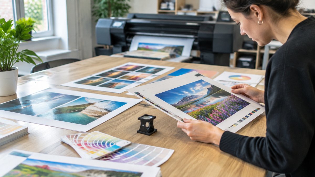
Step 5: Approve a proof before the full run. Ask for a printed proof or a digital soft proof of your main colour and a hard copy of at least one item. A common pattern is to sign off a single business card and a single letterhead before committing to the full quantity, because colour shifts between screen and uncoated paper are hard to judge on a monitor. Check legibility at actual size, confirm every phone number, email and address is correct, and test that the letterhead folds and fits its envelope.
Watch out: a design that looks crisp on a backlit screen can print noticeably duller on uncoated stock, and a logo that reads well in colour may disappear when printed in one colour, always proof the one-colour version too.
Free artwork checks are available, so you can send your files before ordering.
The article's print-ready steps can be scanned at a glance:
| Step | What to do | Key figure |
|---|---|---|
| Set up document | Build at trim size, add bleed | 3mm bleed on all sides |
| Keep safe zone | Keep text and logos inside trim | At least 3mm from trim |
| Colour mode | Use CMYK, not RGB | CMYK throughout |
| Image resolution | Use high-res images at final size | 300dpi or higher |
| Fonts | Embed fonts or convert to outlines | Embed or outline |
| File export | Export press-quality PDF | PDF/X-1a or PDF/X-4 |
| Proof approval | Approve proof before full run | Sign off one card and one letterhead |
Paper, Budget and Quantities: Making the Set Work on Your Spend
Paper choice affects both cost and feel. Heavier stock feels more premium but costs more per sheet, and the gap widens quickly across a full run. A practical split is to spend more on business cards, which are handled often and judged closely, and choose a sensible mid-weight stock for letterheads and envelopes where the paper is mostly read rather than handled.
Pricing depends on quantity, size, paper, finish and delivery date, so check Print Brain's website or request a quote for current prices. The mechanics that drive your total are consistent, though:
-
Unit cost falls as quantity rises. Printers set up a press once per job, so the setup cost is spread across the run. Doubling a quantity rarely doubles the price, which is why bulk printing looks cheaper per item.
-
Finishes add cost. Spot UV, foil, embossing and die-cutting each add a production stage and a setup charge, so use them on the item that is seen most, usually the card, rather than across the whole set.
-
Delivery and turnaround matter. Standard turnaround is cheaper than express, and consolidating items into one order shares one delivery charge and one print setup.
To keep spending under control:
- Order in quantities you will use within six months, rather than large runs that go out of date when an address or phone number changes
- Batch items together so you share one delivery and one print setup
- Reuse the same artwork files for reorders, so you avoid design fees
- Keep a record of the paper, weight and finish used, so reorders match exactly
- Store flat and dry, paper absorbs moisture, and a stack left in a damp cupboard can warp and jam in printers
Consider printing a small first batch of each item to check the set works together before ordering in bulk. When you reorder, ask for the same stock and finish by name and weight; a printer matching a previous job from a sample is more reliable than matching from a photograph. If your quantities are uncertain, a short run now and a larger reorder later usually costs less overall than a bulk order you partly discard.
Ordering Your Set and Reordering Without Losing Consistency
When you place your first order, send all items together if you can. This makes it easier to check that colours and layouts match before anything is printed.
Keep a master folder with the final print-ready PDFs, the brand foundations sheet and the order details for each item. When you reorder, you can request the same paper, finish and colours without starting from scratch.
If you change your logo, address or phone number, update every file in the set at the same time. Reprinting only one item leaves the set looking inconsistent.
A matching business stationery set takes some planning, but the payoff is a professional image across every touchpoint. Print Brain can help with quotes and artwork checks, with fast, reliable delivery. Get in touch to start building your set.
Frequently Asked Questions
What should be included in a business stationery set?
A typical business stationery set covers business cards, letterheads, envelopes and, depending on your needs, notepads and presentation folders. Each item should carry the same logo, colours, fonts and contact details so the set reads as one identity. Start with the items you use most often, such as cards and letterheads, then add envelopes and folders once the design is settled. Keep a short list of the information every item must show, including your company name, address, phone number, email and website, so nothing is missed when you create new pieces later.
How do I make business stationery look consistent?
Build a simple set of brand rules before you design anything: two or three brand colours with exact values, one or two typefaces, a fixed logo size and clear spacing. Apply these rules to every item and check the pieces side by side in the same lighting. Consistency also comes from using the same paper finish across items where possible. Writing down these choices in a one-page brand sheet makes it far easier to keep future orders matching.
Can I use the same design across business cards, letterheads and envelopes?
Yes, but the layout must adapt to each format. Carry over the logo placement, colour palette, typefaces and margins, while adjusting the arrangement of text to suit the size of each piece. A business card has very little space, so prioritise the logo and essential contact details. A letterhead has more room for a header and footer. Envelopes need a clear return address area and a sensible position for the logo so the design stays recognisable at a glance.